Compare Cost of Living Across 128 Countries and Test Affordability
2026-09-26

Small island economies and global financial hubs consistently top cost of living rankings, while lower middle income economies in South Asia and parts of Africa and Latin America sit at the bottom. Those headline numbers come from a benchmark index, a snapshot of relative price levels, not a promise of what you personally will pay. To judge affordability for your own budget, pair that snapshot with current inflation, rent data, and local purchasing power.
TL;DR:
- Cost of living indices are based on a household spending basket and can be heavily influenced by housing and local services, causing significant rank variations.
- Purchasing power parity and price level indices help compare economies structurally, but current affordability requires checking current CPI, rent, and salary data.
- Large-scale differences within countries mean city-specific rent and salary data are essential, as national averages may not reflect actual local costs.
- Currency fluctuations can distort cost comparisons, so relying solely on exchange rates without considering PPP adjustments may lead to misleading conclusions.
- Expats often face higher housing and service costs than locals, and official data sources should be prioritized over crowdsourced indices for accurate affordability assessments.
Table of Contents
- Headline rankings and a compact data snapshot
- What these cost of living indexes measure
- How to read PPPs and PLIs against CPI and private indices
- A step-by-step method to test affordability for your budget
- Most expensive and cheapest countries at a glance
- How Fiatmap’s data and tools help you compare cost of living
- Regional variations within countries affecting cost of living
- How exchange rate swings distort cost comparisons
- How taxes and government policy shape living expenses
- Why lifestyle and consumption habits shift the numbers
- How expats’ cost of living differs from locals
- Limitations and pitfalls of cost of living indices
- What headline rankings get wrong
- Compare countries yourself with Fiatmap’s tools
- Sources
- FAQ
Headline rankings and a compact data snapshot
The International Comparison Program run by the World Bank is the benchmark most cost of living rankings ultimately draw on. Its 2021 exercise put Bermuda, the Cayman Islands, and Switzerland among the economies with the highest GDP price level indices, meaning their overall basket of goods and services costs far more than the world average. The United States ranked ninth globally on this measure, with a GDP price level index of 158, again according to the International Comparison Program.
At the other end, many lower middle income economies post price levels well under half the global average, largely because local services, housing, and labor cost far less in nominal terms even when the goods themselves are similar.
These figures come from the same 2021 benchmarking round, so they are directly comparable to each other, but they age as prices move. That is why a rent listing from last month or this year’s inflation print can shift the practical picture even when the underlying index has not been updated.
What these cost of living indexes measure
A cost of living index is not one number pulled from thin air. It is built from a basket of household spending categories, weighted to reflect how people actually spend, then compared across countries or cities.
- Housing and rent: usually the single largest swing factor between similarly priced countries.
- Food and nonalcoholic beverages: groceries and staples, often the second-largest weight in the basket.
- Utilities: electricity, water, heating, and internet.
- Transport: fuel, public transit fares, and vehicle costs.
- Healthcare: out-of-pocket spending, which varies enormously depending on whether a country has public coverage.
- Restaurants: a discretionary category that tracks lifestyle more than necessity.
- Local purchasing power: what a typical local wage actually buys, which is not captured by price levels alone.
Housing and local services tend to cause the widest rank swings between countries, because rent and labor-intensive services do not trade internationally the way manufactured goods do. Two countries can have similar grocery prices and still land far apart on the headline index once rent is factored in.
How to read PPPs and PLIs against CPI and private indices
Purchasing power parity, or PPP, is an exchange rate that equalizes the cost of the same basket of goods and services across countries. A price level index, or PLI, is simply PPP divided by the market exchange rate. A PLI above 100 means prices for that basket run above the world average, according to the World Bank’s ICP methodology, which also explains how prices get extrapolated between benchmark years using national CPI or national accounts deflators. That extrapolation step matters: a PLI you see today may be built from a 2021 survey adjusted forward, not a fresh price check.
The OECD’s PPP guidance is clear that PPPs and PLIs are structural benchmarks, best suited to comparing economies or informing policy, not to answering “can I afford to live here next month.” For that, you need the consumer price index, current rent listings, and local salary data. Learn more about how purchasing power parity is calculated and how it differs from a simple currency conversion.
Private cost of living indices such as Numbeo or LivingCost sit in a third category. They rely on crowdsourced or city-sampled prices rather than official national surveys, so their baskets and city coverage can differ sharply from the ICP’s. Use PPP benchmarks for big-picture research, the consumer price index plus rent and salary data for a real affordability check, and private city indices as a rough cross-check on the ground, not as a replacement for official data.

A step-by-step method to test affordability for your budget
Running your own comparison beats relying on a single ranking. Follow these steps in order.
- Pick the actual cities, not just countries, since capital cities and financial hubs often cost far more than the national average.
- Choose the right index for your question: PPP for a structural comparison, CPI plus rent for current affordability.
- Collect current CPI, rent, and salary figures for each city, ideally dated within the last year.
- Run a PPP-adjusted comparison to see how far your income would stretch relative to local prices.
- Simulate rent scenarios and healthcare or tax differences, since these two categories vary the most between otherwise similar countries.
Say you want to test whether $500 a month covers a modest life somewhere. That target depends entirely on local rent, which the OECD’s PPP FAQ notes cannot be assumed from a benchmark basket alone. You would need to check actual rental listings, grocery prices, transport fares, and whether healthcare is public or requires private insurance before treating that number as workable.
Pro Tip: Check whether a figure comes from an official government survey or a crowdsourced private index, and always convert at a current exchange rate rather than an average from a year ago, since currency swings can distort a comparison more than the underlying prices do.
Most expensive and cheapest countries at a glance
- Bermuda: small-market premiums and near-total reliance on imports push almost every category above the world average.
- Switzerland: high wages support high prices, especially in housing and restaurants.
- Cayman Islands: island logistics and financial-hub demand for housing drive costs up.
- United States: healthcare and rent in major metro areas pull the national average well above the global benchmark.
- Norway: high wages and taxed goods keep restaurant and grocery prices elevated.
- Iceland: import dependence and a small population base raise per-unit costs across categories.
- Lower middle income economies in South Asia, parts of Sub-Saharan Africa, and pockets of Latin America post price levels well under the world average, largely because housing and labor-intensive services cost far less in nominal terms.
- In these lower-cost economies, imported goods like electronics and some packaged foods can still carry a premium even when rent and local services stay cheap.
How Fiatmap’s data and tools help you compare cost of living
Data on mortgage rates, inflation rates, and dozens of macroeconomic metrics across many countries are sourced from official statistics and presented in interactive tools that users can query. The price level rankings let you compare PLIs country by country, while the inflation rankings show current CPI trends to pair against those benchmarks.
Two quick workflows: first, pull a country’s price level index alongside its latest inflation rate and a current rent estimate to see whether the structural benchmark still matches today’s prices. Second, use the mortgage rate rankings to estimate how loan costs would differ if you bought property in one country versus another, since a lower cost of living does not always mean a lower mortgage rate. Every figure on the platform is sourced from official statistics rather than crowdsourced estimates.
Regional variations within countries affecting cost of living
National averages hide enormous internal variation. A capital city or financial center routinely costs two to three times more than smaller towns in the same country, largely driven by housing demand. In the United States, rent in a major coastal metro dwarfs rent in a mid-sized inland city, even though both fall under the same national CPI figure. Similar splits exist in many countries: coastal or capital regions concentrate jobs, drawing housing demand and pushing local prices up, while rural or inland regions retain lower rents and service costs.
This matters directly for anyone using a national-level index to plan a move. A country-level PLI or CPI tells you almost nothing about the specific neighborhood where you would actually live. If you are comparing options, treat the national figure as a starting range and then check city-specific rent listings and local salary data before committing to a budget. A partner resource on rent rules across U.S. states shows how much local regulation alone can shift what renters actually pay year to year, independent of the national average. Housing price databases at the city level, such as one tracking median housing prices in Wrocław, illustrate the same point: a national or even regional average can mask a city market moving in its own direction entirely.

How exchange rate swings distort cost comparisons
Every cross-country cost comparison ultimately runs through an exchange rate, and that rate can move faster than prices do. A country that looked expensive last year can look cheap this year purely because its currency weakened against the dollar or euro, even if local prices in that currency stayed flat. This is exactly why PPP exists as a concept: it strips out currency swings to compare what a basket of goods actually costs in real terms, rather than what today’s exchange rate happens to say.
For a traveler or expat converting savings from one currency to spend in another, though, the nominal exchange rate is what actually matters day to day, not the PPP-adjusted figure. If your income arrives in a strong currency and you spend in a weaker one, your effective purchasing power can look far better than any price level index would suggest, and the reverse holds just as strongly. Anyone comparing living costs across a currency border should check the current exchange rate and not rely on a rate they remember from months earlier, since currency markets frequently move by meaningful amounts within a single year.
How taxes and government policy shape living expenses
Taxation changes the real cost of living independent of retail prices. A country with high sales tax or value-added tax on everyday goods effectively raises the price of the same basket compared with a country that taxes income instead. Healthcare policy has a similarly large effect: countries with public healthcare systems shift much of that cost out of household budgets and into taxes, while countries relying on private insurance push healthcare into personal spending, which shows up directly in cost of living comparisons even though it reflects a policy choice rather than a market price.
Housing subsidies, rent control, and zoning rules also move the numbers. A city with strict rent control can show artificially low average rents on paper while having a severe shortage of available units, meaning the headline figure understates what a new arrival would actually pay. Government price controls on staples like fuel or bread, common in some economies, can likewise keep certain categories of a cost of living index low even when overall economic pressure is rising elsewhere. None of this shows up cleanly in a single price level number, which is another reason to treat headline rankings as a starting point rather than a full picture.
Why lifestyle and consumption habits shift the numbers
Cost of living indices assume a standard consumption basket, but real households do not spend identically. A household that eats out often will feel restaurant price differences between countries far more than one that cooks at home, even though both live in the same city. Car ownership versus reliance on public transit changes the transport category dramatically, and a country with strong public transit can look expensive on paper while remaining cheap in practice for someone who never buys a car.
Climate and culture also drive consumption patterns that headline indices only partly capture. Heating costs dominate winter budgets in colder countries, while air conditioning plays the same role in hot climates, and neither shows up as a distinct line item in most public rankings. Similarly, countries with strong domestic food production tend to have cheaper groceries than countries dependent on imports, regardless of overall price level. The practical lesson is that your own habits, not the average consumer’s, determine how much a given cost of living index actually applies to you.
How expats’ cost of living differs from locals
Expatriates and locals living in the same city often face meaningfully different costs, even shopping at the same stores. Expats frequently rent in neighborhoods aimed at foreign residents, where prices run higher than the citywide average, and many arrive without access to local social benefits, subsidized healthcare, or family housing arrangements that lower costs for residents. International schooling, when needed, adds a substantial cost that rarely appears in any general cost of living index at all.
On the other side, expats sometimes earn salaries pegged to their home country rather than local wages, which can make an otherwise expensive city feel affordable in practice. This is exactly the gap the OECD’s PPP guidance points to: a country can register a high price level yet remain very livable for someone whose income is high relative to local costs, while the same price level could be unaffordable for a local earning a domestic wage. Anyone relocating should budget separately for expat-specific costs like international insurance and relocation fees rather than assuming the general index covers them.
Limitations and pitfalls of cost of living indices
No cost of living index captures everything, and treating one number as definitive is the most common mistake readers make. Benchmark exercises like the ICP run on a multi-year cycle, so figures you see today may be extrapolated from a 2021 survey using CPI or national accounts data rather than a fresh price check, according to the ICP methodology. Private indices built from crowdsourced entries carry their own sampling bias, since contributors skew toward certain cities, income levels, and lifestyles that may not represent the average resident.
Reference periods differ across sources, so mixing a 2021 PPP figure with a 2025 rent listing without noting the gap can produce a misleading comparison. Baskets differ too: a private index may weight restaurants and imported goods more heavily than an official survey does, which shifts a country up or down in ways that have nothing to do with actual affordability. And no cost index measures safety. The 2025 Global Peace Index ranks Iceland as the most peaceful country in the world, a completely separate axis from affordability that should never be inferred from a low price level. A cheap country is not automatically a safe one, and an expensive country is not automatically a dangerous one to avoid.
What headline rankings get wrong
Headline cost of living rankings flatten a lot of real variation into one number. A country can rank high overall while specific regions inside it are genuinely cheap, and a “cheap” country can still be unaffordable for a local earning a local wage. Recent inflation moves faster than any benchmark survey, so a ranking built on older data can miss a country that has gotten notably more or less expensive since. Treat structural benchmarks, current price signals, and safety indicators as three separate questions, not one score.
— Torstein
Compare countries yourself with Fiatmap’s tools
Reading about rankings only gets you so far. Fiatmap’s Global Money Dataset gives you free, sourced access to price level, inflation, and dozens of other macro indicators across 128 countries, all pulled from official statistics rather than crowdsourced guesses.
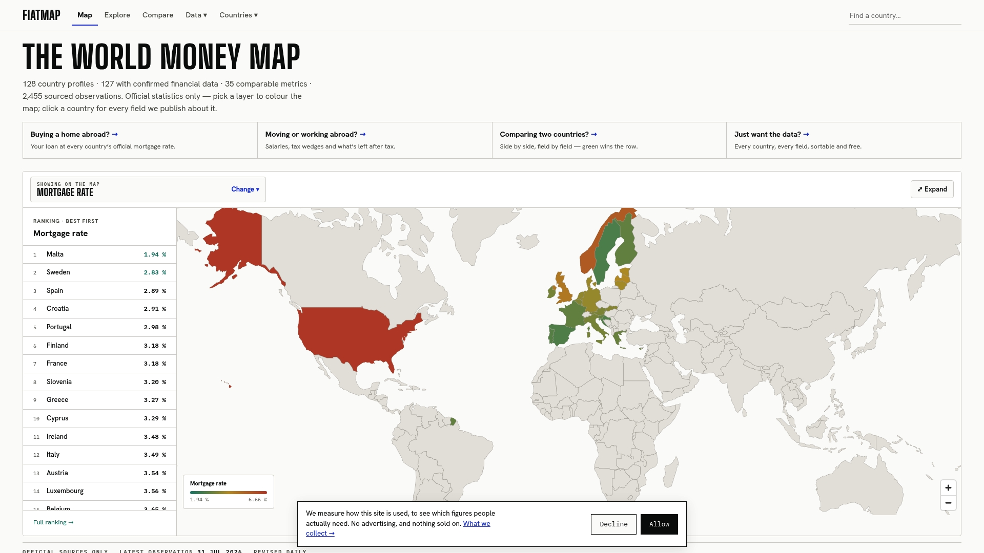
Start with the price level rankings to see how any two countries stack up on the same benchmark, then check current housing costs with the mortgage rate rankings if property is part of your decision. Download the data yourself at Fiatmap and run the comparison that matters for your own budget.
Sources
- International Comparison Program (ICP) — World Bank (ICP 2021 global highlights)
- ICP 2021 methodology (World Bank)
- Purchasing Power Parities - Frequently Asked Questions (OECD)
- 2025 Global Peace Index (Visual Capitalist)
FAQ
What country has the best cost of living?
There is no single “best” country since it depends on your income relative to local prices, not just the price level itself. Countries with lower price level indices tend to stretch a fixed income further, but you should check current rent and salary data for the specific city you have in mind.
What is the cheapest and safest country to live in?
Affordability and safety are measured separately and should not be assumed to overlap. Lower middle income economies often post lower price levels, while the 2025 Global Peace Index ranks Iceland as the most peaceful country, so check both rankings independently rather than assuming a cheap country is automatically safe.
Where does America rank in cost of living?
The United States ranked ninth globally by GDP price level index, at 158, in the World Bank’s 2021 ICP benchmarking exercise. That places it well above the global average, driven largely by housing and healthcare costs.
Which country can I live with $500 a month?
This depends entirely on the specific city, since national averages hide huge internal variation in rent and living costs. Rather than relying on a single number, check current rent listings, grocery prices, and healthcare access for the exact location, since the OECD notes that broad PPP baskets do not guarantee any specific individual budget will work.
Recommended
The figures on this site are collected from official statistics and each carries its own source and date — see /sources and the dataset. Where this article states a number, the country and ranking pages are what it should agree with.