Rent to Income Ratio: 5 Steps to Compare Countries Fairly
2026-10-08

The rent to income ratio is the typical rent in a country or region expressed as a percentage of typical income, used to benchmark housing affordability across borders. It is an aggregate measure, built from median or mean rent and median or mean income, not a personal budgeting rule. The exact figure shifts depending on whether analysts use mean or median values, gross or disposable income, and which costs count as rent, so comparability depends entirely on methodology.
TL;DR:
- For affordability analysis, pair median rent and median disposable income for renter households from the same year and geography, then divide rent by income.
- Always disclose whether rent includes utilities and whether income is gross or disposable; otherwise, similar headline ratios may not be comparable across countries.
- A national average can conceal higher rent burdens in capitals, private markets, and lower income groups, so report results by region, tenure, and income quintile.
- Households spending more than 30% of income on rent are commonly classified as burdened, while those above 40% are often considered severely burdened.
Table of Contents
- What the metric measures and why it matters for comparisons
- How to calculate rent-to-income ratios for comparability
- How analysts and policymakers should interpret the ratio
- Using Fiatmap’s data and tools to compute and compare ratios
- Practical next steps for analysts and policymakers
- Explore comparable housing and income data on Fiatmap
- FAQ
- Sources
What the metric measures and why it matters for comparisons
This ratio works at the population level: it describes rent burden across a country, a region, or a city, not whether one household can afford one lease. That distinction matters because a national average can mask sharp differences between income groups, cities, and tenure types. A country with a moderate national ratio can still have renters in its capital spending far more of their income on housing than renters in smaller towns.

The choice between median and mean changes the story. Mean income is pulled upward by high earners, which can understate burden for typical households, while median income reflects the middle of the distribution and is generally preferred for affordability analysis. Whether income is measured before or after taxes and transfers (gross versus disposable) also moves the ratio, sometimes substantially, since disposable income accounts for the money a household actually has to spend.
Analysts, investors, and policymakers rely on this metric to answer a handful of recurring questions:
- How has affordability shifted over time in a given market.
- Which countries or regions carry the highest rent burden relative to income.
- Where rental stress is concentrated by income group, age, or tenure type.
- Whether housing policy interventions are narrowing or widening the gap.
None of these questions can be answered reliably without knowing exactly how the underlying ratio was built.
How to calculate rent-to-income ratios for comparability
A reproducible calculation starts with three inputs: median market rent for the period and geography in question, median disposable household income for the same population, and, where available, household weighting that reflects the renter population rather than all households. Mixing owner-occupier income data with renter-only rent data is a common error that inflates affordability and should be avoided.
- Collect rent and income series from the same reference year and geography.
- Compute the median rent and median disposable income for renter households specifically.
- Divide median rent by median income and multiply by 100 to express it as a percentage.
- Decide whether utilities are included in the rent figure and apply that choice consistently across countries.
- Adjust for purchasing power parity (PPP) when comparing real living standards, or keep nominal local currency when comparing cost shares, since the ratio itself is already a share and does not require currency conversion.
Several pitfalls undermine comparability even when the arithmetic is correct. Survey coverage varies: some national surveys exclude informal or short-term rentals, understating the true rental market. Tenure mix matters too, since countries with large social or regulated rental sectors can show a lower blended national ratio even where private market rents are unaffordable for many households. The OECD Affordable Housing Database documents these methodological choices and recommends disaggregating by income quintile rather than relying on a single national figure.
Pro Tip: Always report whether your rent figure includes utilities and whether income is gross or disposable; a single footnote prevents most cross-country misreadings.
How analysts and policymakers should interpret the ratio
Median figures are generally the right default for policy and affordability work, since they are less distorted by high earners than a mean. Mean values still have a place in macroeconomic modeling, but labeling which one is used should be automatic in any report. Disaggregating by income quintile, tenure type, and region turns a single flat ratio into something a policymaker can act on, since it reveals who carries the burden rather than just how large it is on average.
Comparative series also need to handle regulated and social housing carefully. Countries with substantial subsidized rental stock can report a lower national ratio even while private market rents remain out of reach for many households, so a market-rent-only series should be reported alongside any blended figure. The Harvard Joint Center for Housing Studies notes that income inequality, measured by the Gini coefficient, and tenure mix explain much of the apparent gap between countries with similar headline ratios.
- Pair the ratio with a Gini coefficient or tenure-share chart whenever publishing a cross-country comparison.
- Publish the metadata: data source, reference year, income definition, and whether utilities are included.
Pro Tip: A ratio published without its methodology note is not comparable to anyone else’s ratio, even if the numbers look similar.
Using Fiatmap’s data and tools to compute and compare ratios
We build our datasets from official statistics across many countries, which makes them a practical starting point for this kind of comparative work. Our median income map and take-home-pay map give you the income side of the equation in either gross or disposable terms, depending on which definition your analysis calls for.
A simple walkthrough: pull median income for your target countries from either map, pair it with a rent series from a national statistics office or Eurostat, and compute the ratio in a spreadsheet using the steps above. Once you have the figures, you can visualize them using our embeddable maps or reference our data stories for examples of how we present comparative housing and income data.
Practical resources worth using directly:
- The median income map for cross-country income series.
- The take-home-pay map when disposable income is the right denominator.
- The Global Money Dataset for CSV and JSON exports you can script against.
- Our cost-of-living comparisons for pairing rent burden with broader affordability context.
If you work on the investment side rather than the policy side, resources like WealthStacker’s renter financial modeling guide offer complementary modeling approaches for evaluating rental property decisions once you have the macro picture in hand.
Practical next steps for analysts and policymakers
The rent to income ratio is most useful as a screening tool: it flags where to look closer, not a final verdict on affordability. It can mislead when reported as a single national number without quintile, tenure, or regional breakdowns, since those are exactly where the real stress concentrates.
Before publishing or acting on a ratio, disaggregate by income group and tenure, document every definitional choice, compare against an inequality or tenure-mix indicator, and check a local survey when the stakes are high. From there, exporting comparable income series and building your own visualizations is the fastest way to benchmark rapidly across markets.
— Torstein
Explore comparable housing and income data on Fiatmap
We source every dataset from official statistics across 128 countries, so when you pair our median income and take-home-pay maps with a rent series, you get a ratio you can actually defend in a cross-country report.
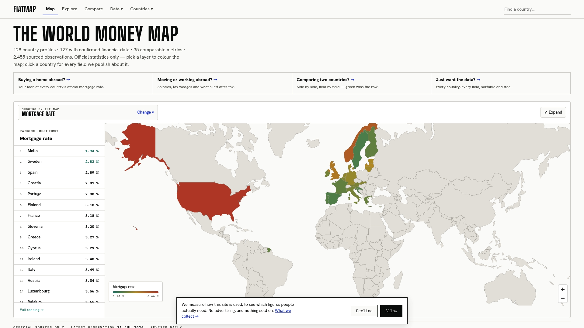
Download the figures directly from our Global Money Dataset in CSV or JSON format, or start from our world money map to explore income and cost indicators by country before you build your next comparison.
This article is general information, not a substitute for advice from a qualified financial advisor. Consult a qualified financial professional about your own circumstances before acting on anything here.
FAQ
What is a healthy rent-to-income ratio at the country level?
There is no single healthy threshold, but policy analysts commonly flag households spending over 30% of income on rent as burdened and over 40% as severely burdened. The Eurostat overburden rate uses the 40% threshold and found 8.2% of the EU population exceeded it in 2024 data.
Why do rent-to-income ratios differ so much between countries?
Differences come from both real affordability gaps and methodology: whether income is median or mean, gross or disposable, and whether rent includes utilities all shift the result. The JCHS research also points to income inequality and tenure mix, such as the size of a country’s social housing sector, as major drivers of apparent cross-country gaps.
How many renters worldwide are considered rent-burdened?
Globally, 44% of tenant households spent more than 30% of their income on rent in 2023, according to the UN-Habitat World Cities Report 2026. That figure covers renter households specifically, not the full population.
Should I use gross or disposable income when calculating this ratio?
Disposable income, which accounts for taxes and transfers, is generally preferred for affordability analysis because it reflects what a household actually has available to spend. The OECD Affordable Housing Database recommends being explicit about which definition is used, since gross and disposable figures can produce materially different ratios for the same country.
Sources
Globally, 44% of tenant households spent more than 30% of their income on rent in 2023, according to the UN-Habitat World Cities Report 2026. That figure sets the baseline most cross-country affordability discussions now reference, and it reflects renters specifically rather than all households.
Within the European Union, Eurostat’s 2024 housing data found that 8.2% of the EU population lived in households spending 40% or more of disposable income on housing, a threshold Eurostat labels “overburden.” Country-level variation was wide: Greece recorded the highest overburden rate at 28.9%, while Cyprus recorded the lowest at 2.4% in the same reporting.
The OECD’s Affordable Housing Database adds a distributional layer, showing that in many OECD member countries low-income renters commonly spend over 40% of disposable income on housing, a far higher share than the national average implies. A few patterns recur across these sources:
Reading any single headline number without its income quintile and tenure context risks drawing the wrong conclusion about where housing stress actually concentrates.
Recommended
The figures on this site are collected from official statistics and each carries its own source and date — see /sources and the dataset. Where this article states a number, the country and ranking pages are what it should agree with.