Current Account by Country: Why GDP Shares Change the Picture
2026-10-11

The canonical sources for country-level current account figures are the World Bank, the IMF, the OECD, and Eurostat. Check two numbers for any country: the current account total in current US dollars and the current account as a percent of GDP. Download a country table for the most recent available year before drawing any conclusions about who runs surpluses or deficits.
TL;DR:
- Use current account as a share of GDP to compare external imbalances; dollar rankings favor large economies because their trade and income flows are bigger.
- Match the same year or quarter, unit, and seasonal adjustment status before comparing countries; otherwise, mixed reporting periods can produce misleading rankings.
- Commodity price spikes can inflate surpluses temporarily, while multinational profit shifting can distort small economies’ primary income balances without changing underlying trade conditions.
- Eurostat reports quarterly EU data, while World Bank figures are typically annual; check each export’s vintage because the latest available years may differ.
- A positive balance means net lending abroad, and a negative one means borrowing, but datasets may use different sign conventions, so verify definitions.
Table of Contents
- A Snapshot: Absolute Dollars Versus Percent of GDP
- How to Compare Countries Without Getting Misled
- Where to Download the Raw Data
- How Fiatmap Speeds Up the Comparison
- What Actually Counts as a Country’s Current Account
- How Often the Numbers Update and How Current They Are
- What Recent Imbalances Tell Us
- Compare Countries Faster With Fiatmap
- FAQ
- Sources
- Primary Data Portals and Reports
A Snapshot: Absolute Dollars Versus Percent of GDP
A country’s current account can be reported two ways, and they tell different stories. The absolute total in current US dollars shows the raw size of a surplus or deficit, which tends to favor large economies simply because their trade and income flows are bigger in dollar terms. The percent-of-GDP figure normalizes that number against the size of the economy, which is why a small country can show an enormous imbalance relative to its GDP while barely registering on a global dollar ranking.
The World Bank’s WDI metadata defines the current account balance as the sum of net exports of goods and services, net primary income, and net secondary income, and it publishes both the dollar series and the percent-of-GDP series side by side.
Here is an illustrative snapshot style you would build from a downloaded country table, showing why the two metrics diverge:
| Country | Current account (illustrative) | Current account (% of GDP, illustrative) |
|---|---|---|
| Large surplus economy (e.g., China) | Large positive total, driven by trade surplus | Moderate positive percentage |
| Large deficit economy (e.g., United States) | Large negative total, driven by goods trade | Smaller negative percentage relative to economy size |
| Small open economy with export concentration | Modest total | Large positive or negative percentage |
| Commodity exporter during a price upswing | Positive total | Elevated percentage during the cycle |
| Small deficit economy with heavy import reliance | Modest negative total | Large negative percentage |
A few things to keep in mind when reading a table like this:
- A positive sign means the country is a net lender to the rest of the world; a negative sign means it is a net borrower.
- The same economic flow can appear with different signs across datasets depending on whether the series reports the balance from the resident or nonresident perspective, so always confirm the convention before comparing figures across sources.
- Absolute dollar rankings are dominated by the largest economies almost by construction, which is why serious comparisons lean on the percent-of-GDP version.
How to Compare Countries Without Getting Misled
Percent of GDP is the metric that makes cross-country comparison meaningful, because it controls for the sheer size difference between, say, a small island economy and a continental one. Without that adjustment, you are really just ranking economies by size, not by external imbalance.
Matching years and units matters just as much. A current account figure from one country’s latest quarter should not be set against another country’s full-year figure from two years earlier. Eurostat’s quarterly balance-of-payments tables update more frequently than most annual World Bank series, so mixing vintages without labeling them is an easy way to produce a misleading table.
Watch for one-off distortions too. A commodity price spike can push a surplus sharply higher for a year or two without reflecting a structural shift, and multinational profit shifting can swing a small economy’s primary income balance in ways that have little to do with its underlying trade position.
A short checklist before comparing two countries:
- Confirm both figures use the same year or quarter.
- Confirm both figures use the same unit (current US dollars or percent of GDP), not one of each.
- Check whether either country’s number is skewed by a known one-off, such as a commodity windfall or a large corporate repatriation.
- Note whether the data is seasonally adjusted, since quarterly series often are and annual series often are not.
Pro Tip: When in doubt, pull both the dollar total and the percent-of-GDP figure for each country side by side; disagreements between the two often reveal which one is driving the headline comparison.
Where to Download the Raw Data
Each primary source organizes its current account series a little differently, and knowing the right indicator saves time.
- World Bank WDI: Search the data portal for “current account balance” to find the series in current US dollars (code BN.CAB.XOKA.CD) and as a percent of GDP (code BN.CAB.XOKA.GD.ZS); filter by country or region, then export to CSV or Excel directly from the results table.
- IMF: The DataMapper tool lets you select “Current Account Balance” from the external sector category and build a country or regional table; the External Sector Report annex tables carry the same series alongside analytical commentary for major economies.
- OECD: The balance of payments indicator pages on the OECD data site let you filter by country and frequency, then export the selected table as CSV.
- Eurostat: The bop (balance of payments) dataset section lists current account tables by EU member state, including the quarterly releases with partner-country breakdowns, exportable directly from the data browser.
Licensing and update frequency vary: World Bank and Eurostat data are generally available for reuse with attribution, IMF data carries its own terms on the publications site, and update cadence ranges from quarterly (Eurostat, some IMF series) to annual (most World Bank WDI series). Always note the vintage date printed on the export, since a table downloaded today may still reflect data finalized months earlier.
How Fiatmap Speeds Up the Comparison
We built our Global Money Dataset so readers do not have to stitch together exports from four different portals every time they want to compare countries. Coverage spans many countries, and figures trace back to official statistical sources rather than third-party estimates, which matters when citing numbers in reports or presentations.
A practical workflow we support:
- Pick the countries you want to compare from the current account data page.
- Compare current account as percent of GDP side by side, with the dollar totals available in the same view.
- Download the result as CSV or JSON for analysis.
- Embed one of our free widgets to drop a live macro map or card straight into a presentation or article.
Pro Tip: Pair a current account comparison with our GDP per capita rankings to see whether a country’s external position lines up with how wealthy it is per person, which often explains outliers better than the raw figures alone.
What Actually Counts as a Country’s Current Account
The current account is one of the two main components of a country’s balance of payments, and it is built from four parts. Net exports of goods covers physical merchandise crossing borders, while net exports of services covers things like tourism, shipping, and financial services. Primary income covers cross-border earnings such as wages, interest, and dividends, net of what residents pay to foreigners. Secondary income covers transfers that do not involve an exchange, such as remittances and foreign aid.

The IMF’s Balance of Payments and International Investment Position Manual (BPM6) frames the current account balance as equivalent to an economy’s saving-investment gap: a country running a surplus is saving more than it invests domestically and lending the difference abroad, while a country running a deficit is investing more than it saves and borrowing the difference from the rest of the world. That framing explains why current account imbalances are often discussed alongside fiscal deficits and national savings rates rather than treated purely as a trade statistic. For a deeper primer on how the components fit together, our balance of payments explainer walks through the goods, services, and income categories with practice data.
How Often the Numbers Update and How Current They Are
Reporting frequency differs by source, and that affects how recent the figure you are looking at actually is. Eurostat publishes quarterly balance-of-payments tables for EU member states, which means European figures can be only a few months old at any given time. The World Bank’s WDI series, by contrast, is typically annual and can lag by a year or more depending on how quickly national statistical agencies report to the Bank.
The IMF publishes both: DataMapper figures update as countries report, while the annual External Sector Report consolidates a snapshot for major economies once a year with deeper analytical commentary. The OECD’s balance of payments indicators sit somewhere in between, often available quarterly for member countries but with some lag before preliminary figures are revised to final.
When you are building a country comparison table, the practical takeaway is to always check the “latest available year” column rather than assuming every country reports on the same calendar. A table that mixes a 2025 figure for one country with a 2026 figure for another without labeling the difference will produce a misleading ranking.

What Recent Imbalances Tell Us
The IMF’s 2026 External Sector Report found that global current account balances widened in 2025, with China and the United States among the largest contributors. Shifts like this often trace back to saving-investment gaps, commodity cycles, or sector-specific booms rather than a single policy cause.
— Torstein
Compare Countries Faster With Fiatmap
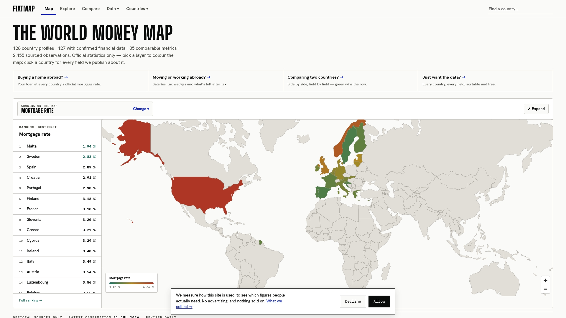
Pulling current account figures from four separate portals, matching years, and converting units takes real time, and we built our Global Money Dataset so you can skip that work. Figures from official statistical sources cover many countries, with both dollar totals and percent-of-GDP views in one place.
- Browse current account figures alongside related metrics like GDP growth and inflation for the same country.
- Download any country table as CSV or JSON for spreadsheet or report use.
- Embed a live macro map or card from our widget library directly into a presentation.
Visit the Fiatmap data page to pick your countries and start comparing.
This article is general information, not a substitute for advice from a qualified financial advisor. Consult a qualified financial professional about your own circumstances before acting on anything here.
FAQ
Which countries have the largest current account deficits?
The largest deficits in dollar terms tend to belong to the biggest economies, since absolute totals scale with economy size; the IMF’s 2026 External Sector Report names the United States among the largest deficit contributors in 2025. Ranking by percent of GDP instead can surface smaller economies with proportionally larger imbalances.
What is a current account for a country?
A country’s current account measures the net flow of goods, services, primary income, and secondary income between that country and the rest of the world. Under the IMF’s BPM6 framework, the balance reflects the gap between a country’s domestic saving and its domestic investment.
Which countries have the highest fiscal deficits?
Fiscal deficits and current account deficits are related but distinct measures, since one tracks government spending versus revenue while the other tracks a country’s trade and income flows with the rest of the world. The Congressional Budget Office tracks U.S. fiscal deficit trends specifically, and figures for other countries should be checked against each country’s own budget authority rather than assumed to move in lockstep with its current account.
Which country runs the largest trade deficit with the United States?
Current account and balance of payments data are reported by country in aggregate against the rest of the world, not typically broken out as bilateral deficits with a single trading partner, in the standard World Bank or IMF series. Bilateral trade balance figures are a separate dataset, usually published by national trade agencies rather than the current account series covered here.
Sources
- World Bank WDI — current account (% of GDP) metadata
- IMF External Sector Report 2026
- Eurostat — Current account, EU indicators (Q2 2026 report)
Primary Data Portals and Reports
For readers who want to verify or build on these figures directly, these are the portals and reports referenced throughout this piece:
- World Bank WDI current account metadata: series definitions and the percent-of-GDP indicator.
- IMF External Sector Report 2026: annual analysis and country-level annex tables.
- Eurostat current account tables: quarterly EU member state figures with partner breakdowns.
- IMF BPM6 manual: the methodological reference for how the current account is defined and measured.
- CBO budget topics: U.S. fiscal context for readers connecting deficits to external balances.
Recommended
The figures on this site are collected from official statistics and each carries its own source and date — see /sources and the dataset. Where this article states a number, the country and ranking pages are what it should agree with.